Moneysworth wins Best Small Protection Advice Firm 2023!
Learn more
Call us 01625 462 744

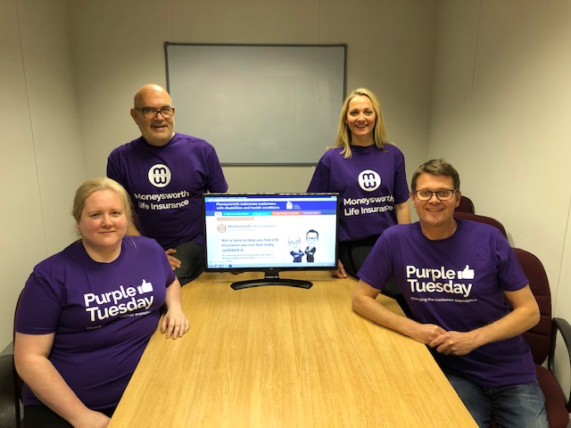
We took part in last year’s event, and we’re proud to be doing so again today!
Purple Tuesday was started by the aptly named Purple, an organisation which also offers accessibility consultancy, training and auditing services. We like what they do, and earlier this year we signed up to become a member so we can learn how to make our business more inclusive.
At Moneysworth, our mission is to improve access to Life Insurance for people who have struggled to find cover they can afford or have been refused cover, usually because they’ve been deemed a higher risk due to an existing health condition.
For most Moneysworth clients, their first engagement with us is when they use our website.
We knew our website already had features that were built with accessibility in mind, such as fairly large font sizes, touch screen compatibility and menus that could be used with just a keyboard – but is that good enough? What other improvements should we add?
How would you find your way around a website if you have visual, motor or cognitive impairments? How would you click a link, open a menu or fill in a form if you can’t operate a mouse or you have difficulty seeing and reading?
When we asked ourselves these questions, we realised we didn’t have all the answers. So we asked Purple to audit our website.
Their report identified a number of ways we could improve what is “already a good site”, and it also identified where we could make improvements to provide an easier experience for people with visual impairments or physical disabilities.
Our web designer found optimum ways to implement these changes without radically changing the design of the Moneysworth site.
Going through this process has been an interesting and revealing exercise. Now that we’ve put these improvements in place, we’ll continue to ensure we consider maximum accessibility for all users as we add new content and features to the Moneysworth website.

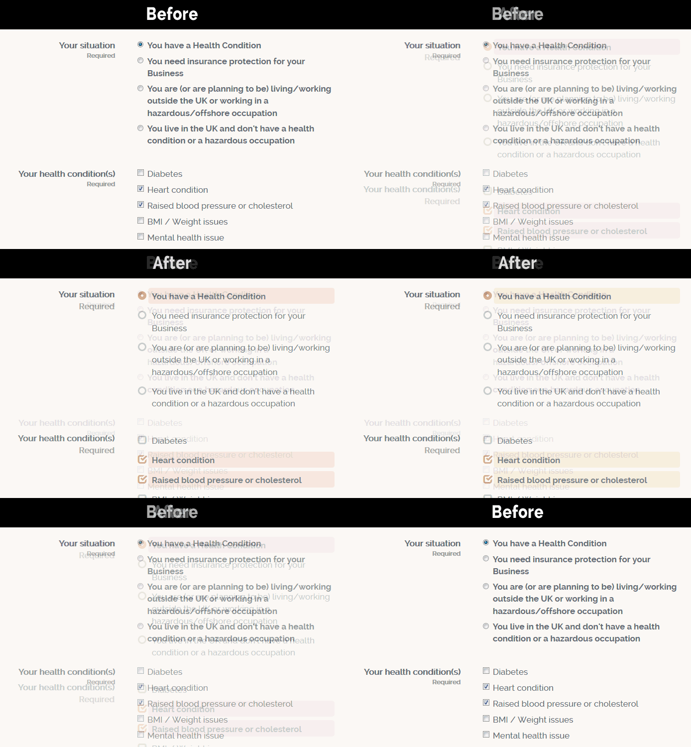
Before and after: some of the visual usability improvements we made to our ‘Get a Quote’ form. Better spacing, larger ‘Required’ labels, buttons and checkboxes that can be navigated and switched on/off with the keyboard, and a more prominent presentation of the options the user has selected.